Consolidated Billing
Consolidated Billing
Consolidated Billing
A scalable billing and invoice experience that helps users understand consolidated charges, identify each payment, and track billing records over time.
A scalable billing and invoice experience that helps users understand consolidated charges, identify each payment, and track billing records over time.
A scalable billing and invoice experience that helps users understand consolidated charges, identify each payment, and track billing records over time.
My role
My role
Sole Product Designer
The team
2 PMs, 2 Engineers, 1 QA
Scope
Scope
IA, order history, invoice design
All customer, billing, payment, and address information shown uses mock data for portfolio demonstration purposes.
Problem
Fragmented billing history
The existing order history listed charges as individual date-based entries. For users with multiple lines, add-ons, devices, or payment methods, it was difficult to understand what each charge was for, which charges were related, and how their billing history added up over time.
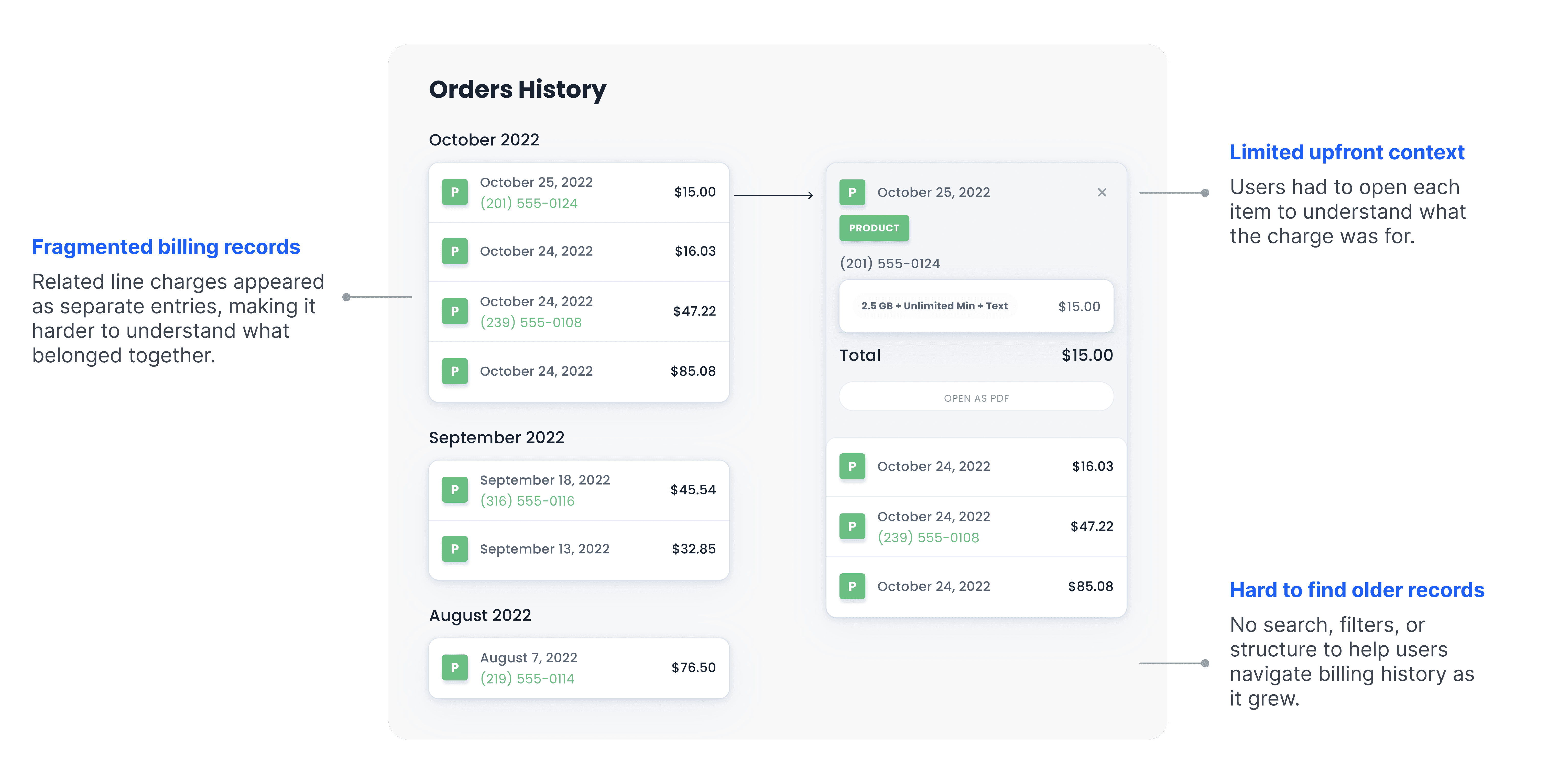
Previous order history experience before redesign
Goal
A clearer billing view
The goal was to consolidate related charges into a clearer billing view, helping users quickly understand what each payment covered while still giving them access to itemized invoice details when needed.

Process 01
Understanding consolidation rules
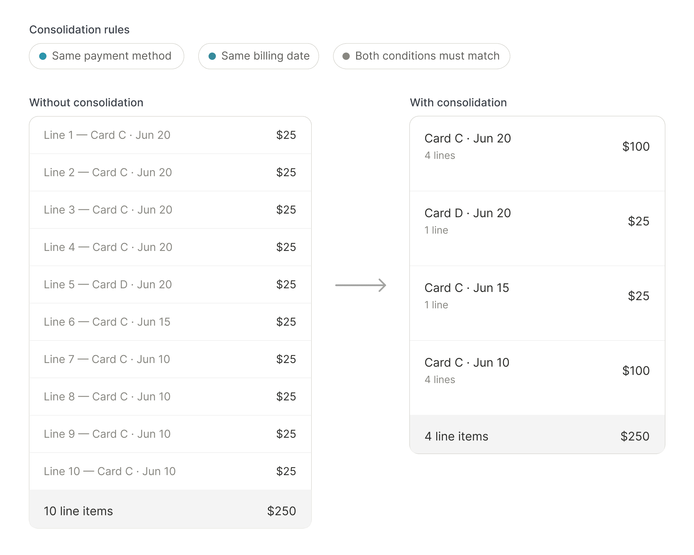
Before designing the interface, I first needed to understand the rules behind consolidation: which charges could be grouped together, which needed to remain separate, and how edge cases changed based on line count, payment method, and billing date. I broke down the product brief, mapped sample customer scenarios, and used them to identify how charges should be grouped under each billing rule.
Process 02
Structuring billing information
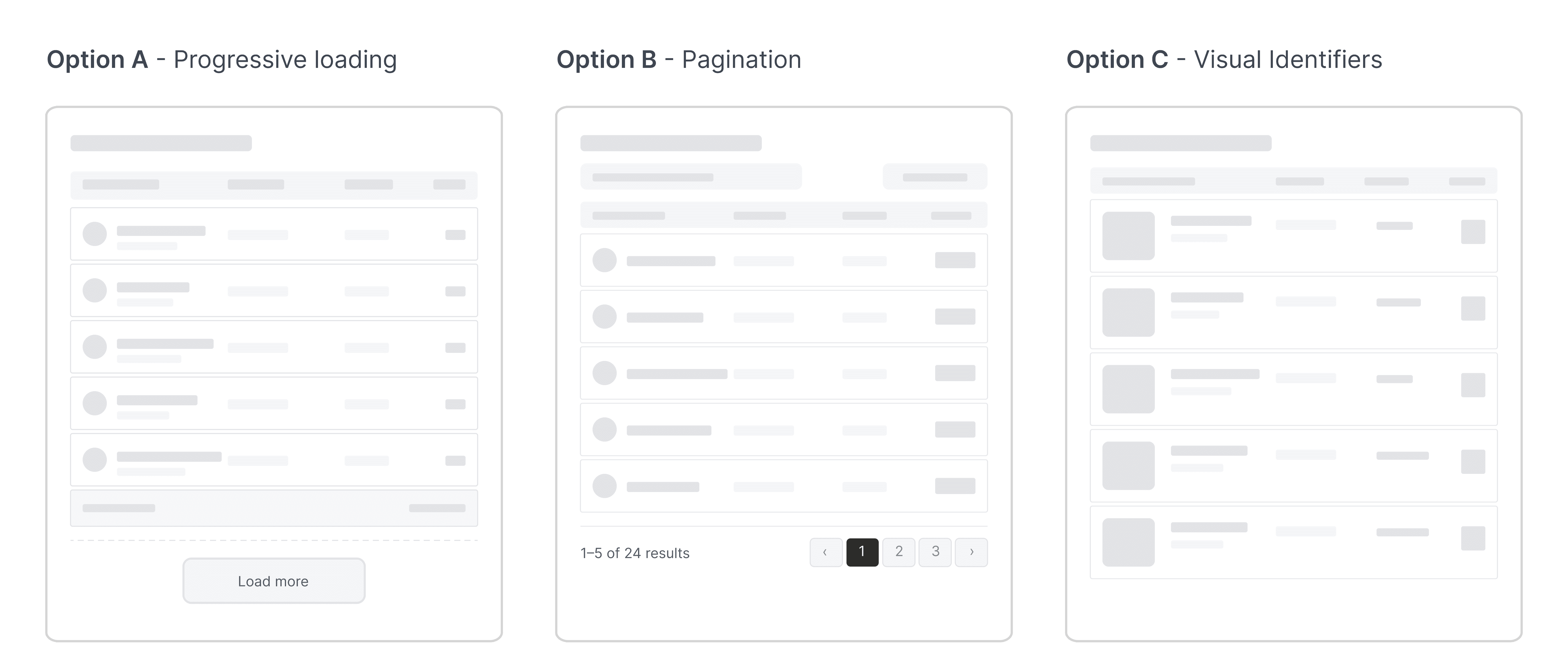
With the consolidation rules clarified, I started shaping the billing history into a clearer information structure. I reviewed common billing and order-history patterns, then tested several table directions against our own scenarios to see how each layout handled recurring charges, consolidated payments, and mixed order types.
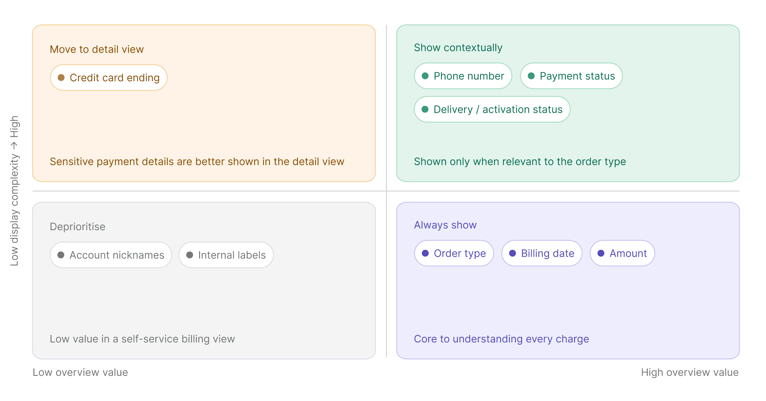
Through design reviews with PMs, I iterated on what information should appear in the billing table versus the invoice/detail view. We prioritized fields that helped users recognize and verify a charge quickly, while moving sensitive or lower-signal details out of the overview.
Process 03
Designing for scale
Decision 1: Create a dedicated order history page
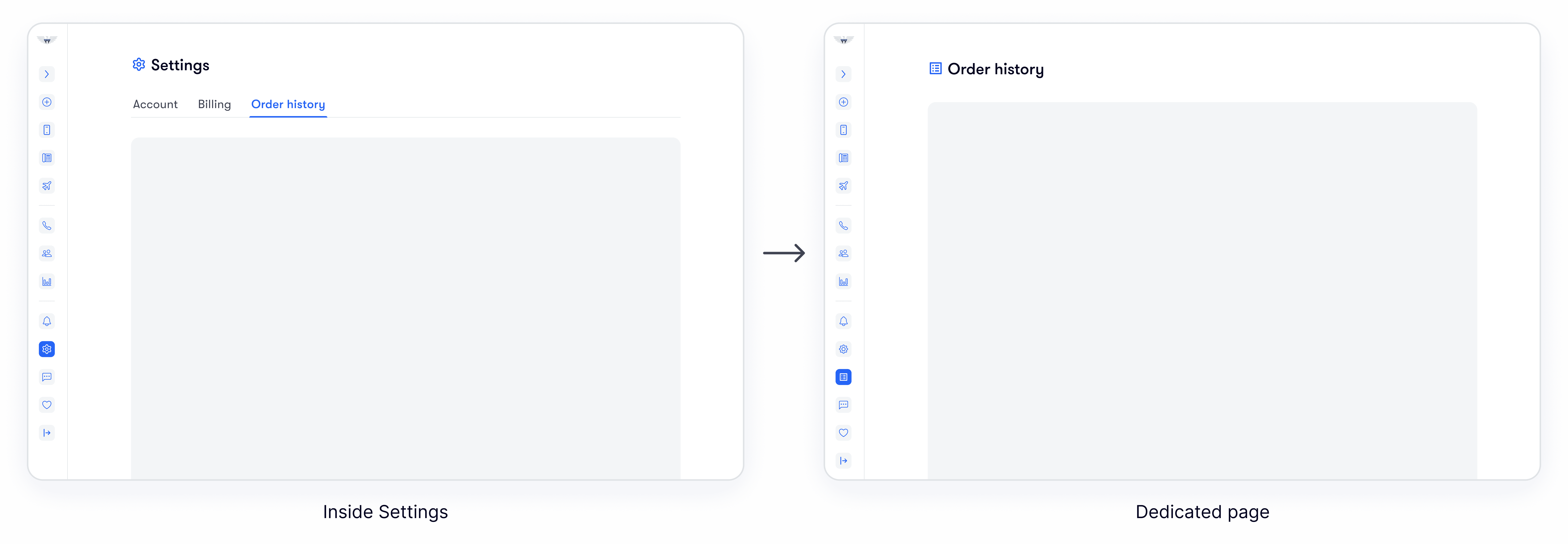
Order History was first considered inside Settings, near billing controls like payment methods and addresses. But reviewing past charges and invoices was a different user intent, so we moved it to a dedicated page that was easier to find and scale.
Decision 2: Organize records by month
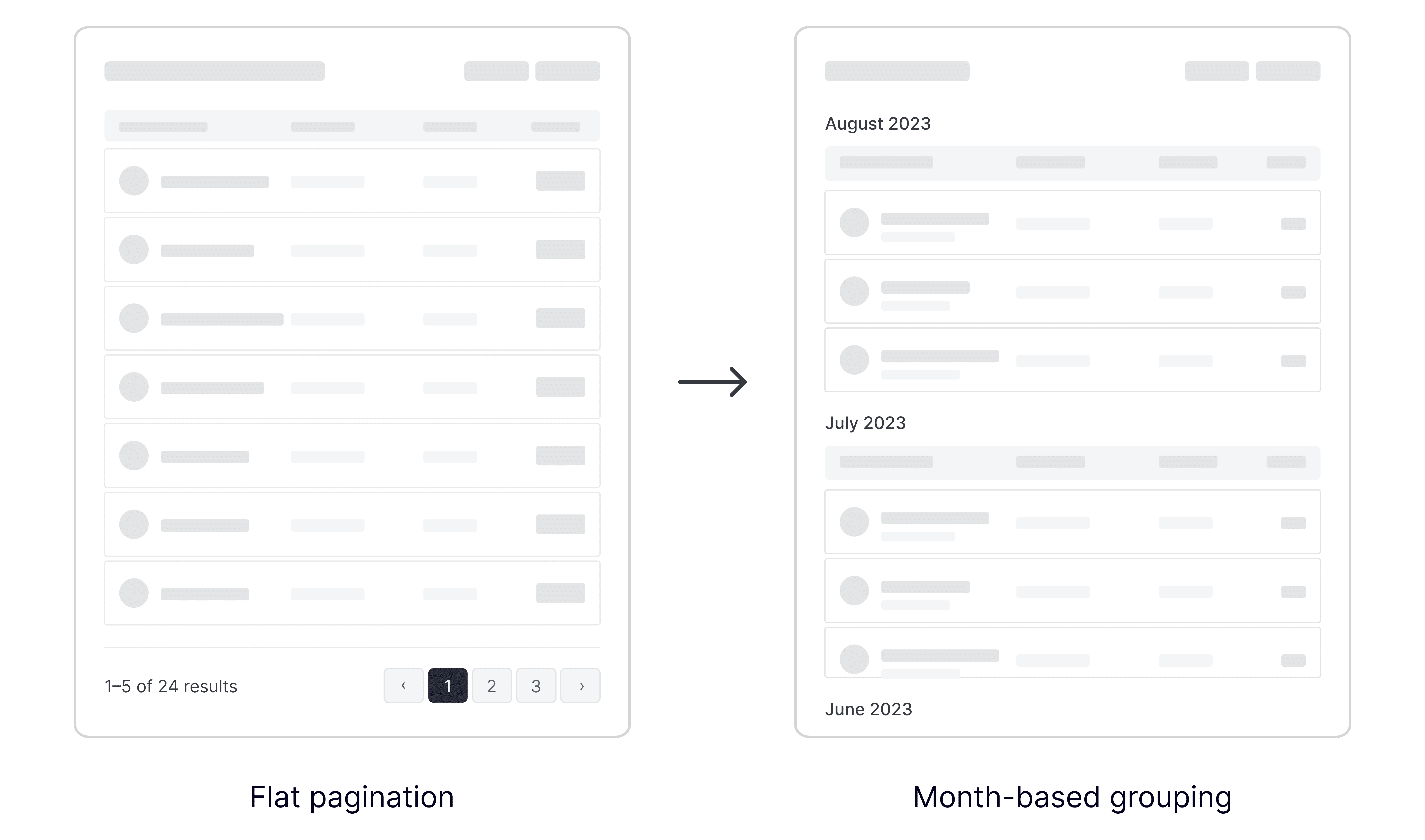
With multiple lines and recurring payments, a flat paginated list could make users move page by page to find charges from a specific month. We grouped records by month instead, giving users clearer time anchors and making billing history easier to scan.
Solution
Design highlights
Making consolidated charges recognizable
When consolidation is on, charges from the same billing date and payment method are grouped into one order. The row stays easy to scan with a phone number summary and “+ more lines,” while the invoice gives users the full line-by-line breakdown.
Helping users find past records faster
I added search, type filters, and date-range controls so users can narrow billing history based on what they remember. Monthly sections then give the results clearer time anchors, making it easier to jump to the right period and scan past records.
Responsive mobile layout
Order history was adapted for smaller screens, keeping search, filters, and invoice access available in a compact layout.
Takeaways
Designing for the right level of detail
Clarity is not always about showing more
In billing experiences, users need enough information to trust a charge, but not so much that every record becomes harder to scan. This project reminded me that clarity comes from matching the level of detail to the user’s moment: Order History should help users quickly recognize what happened, while the invoice should hold the deeper breakdown when they need to verify the details.
Scalable design starts with organizing user intent
As billing history grows, the experience needs to support different ways of looking back: scanning recent payments, narrowing by type or date, and finding a specific record from months ago. Instead of only adding more records to the same page, I focused on the structure around those records, using a dedicated space, monthly grouping, and filters to make the history easier to navigate over time.
Problem
Fragmented billing history
Fragmented billing history
The existing order history listed charges as individual date-based entries. For users with multiple lines, add-ons, devices, or payment methods, it was difficult to understand what each charge was for, which charges were related, and how their billing history added up over time.
Previous order history experience before redesign
Goal
A clearer billing view
A clearer billing view
The goal was to consolidate related charges into a clearer billing view, helping users quickly understand what each payment covered while still giving them access to itemized invoice details when needed.
Process 01
Understanding consolidation rules
Understanding consolidation rules
Before designing the interface, I first needed to understand the rules behind consolidation: which charges could be grouped together, which needed to remain separate, and how edge cases changed based on line count, payment method, and billing date. I broke down the product brief, mapped sample customer scenarios, and used them to identify how charges should be grouped under each billing rule.
Process 02
Structuring billing information
Structuring billing information
With the consolidation rules clarified, I started shaping the billing history into a clearer information structure. I reviewed common billing and order-history patterns, then tested several table directions against our own scenarios to see how each layout handled recurring charges, consolidated payments, and mixed order types.
Through design reviews with PMs, I iterated on what information should appear in the billing table versus the invoice/detail view. We prioritized fields that helped users recognize and verify a charge quickly, while moving sensitive or lower-signal details out of the overview.
Process 03
Designing for scale
Designing for scale
Decision 1: Create a dedicated order history page
Order History was first considered inside Settings, near billing controls like payment methods and addresses. But reviewing past charges and invoices was a different user intent, so we moved it to a dedicated page that was easier to find and scale.
Decision 2: Organize records by month
With multiple lines and recurring payments, a flat paginated list could make users move page by page to find charges from a specific month. We grouped records by month instead, giving users clearer time anchors and making billing history easier to scan.
Solution
Design highlights
Design highlights
Making consolidated charges recognizable
When consolidation is on, charges from the same billing date and payment method are grouped into one order. The row stays easy to scan with a phone number summary and “+ more lines,” while the invoice gives users the full line-by-line breakdown.
Helping users find past records faster
I added search, type filters, and date-range controls so users can narrow billing history based on what they remember. Monthly sections then give the results clearer time anchors, making it easier to jump to the right period and scan past records.
Responsive mobile layout
Order history was adapted for smaller screens, keeping search, filters, and invoice access available in a compact layout.
Takeaways
Designing for the right level of detail
Clarity is not always about showing more
In billing experiences, users need enough information to trust a charge, but not so much that every record becomes harder to scan. This project reminded me that clarity comes from matching the level of detail to the user’s moment: Order History should help users quickly recognize what happened, while the invoice should hold the deeper breakdown when they need to verify the details.
Scalable design starts with organizing user intent
As billing history grows, the experience needs to support different ways of looking back: scanning recent payments, narrowing by type or date, and finding a specific record from months ago. Instead of only adding more records to the same page, I focused on the structure around those records, using a dedicated space, monthly grouping, and filters to make the history easier to navigate over time.