Status Dashboard
My role
Lead Product Designer, leading end-to-end UX/UI, research, and delivery.
The team
1 Designer (me), 1 Product Manager, 1 Customer Support Specialist, 2+ Engineers, 1 QA Specialist
The problem
After users purchase a new line or start a number transfer, they land on a dashboard that essentially says: “We’re working on it, please wait.” Without a clear timeline, progress, or next steps, the waiting period feels uncertain, especially when users temporarily lose signal and assume something went wrong.
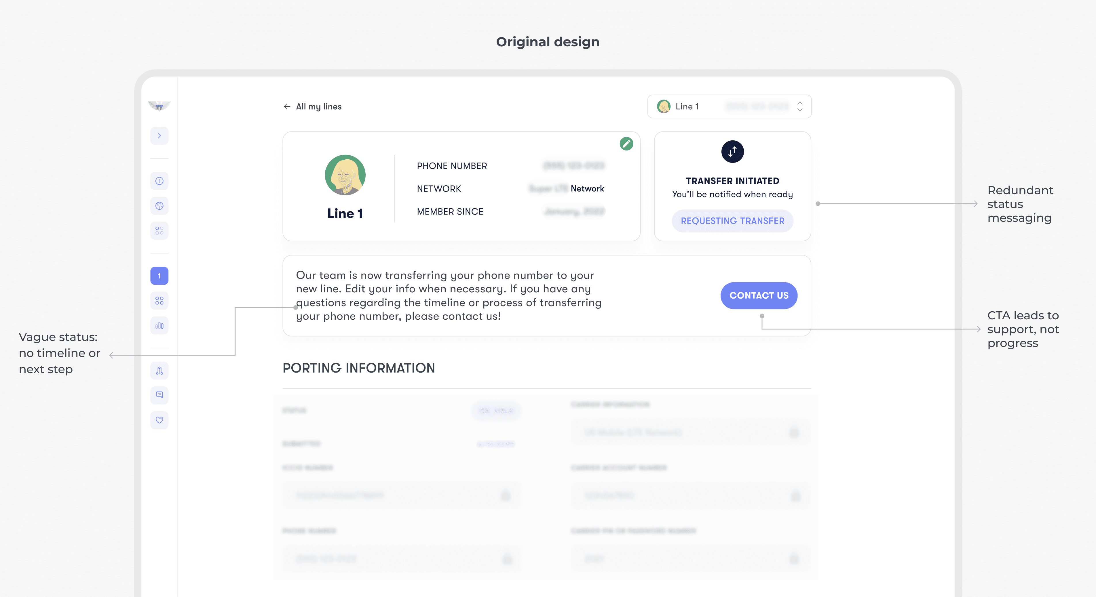
Solution highlight
To make the waiting experience feel more predictable, I redesigned the status dashboard to clearly show what’s happening, with progress, expectations, and the right next step for each stage.


Understanding what’s really happening
Before redesigning the dashboard, I mapped the experience from both the user and system side.
User side
I transferred my own number to US Mobile and documented the experience step by step. I also ran quick interviews with 5 people who had gone through either a number transfer or a new number setup. This helped me understand what users feel during the wait and what they need to stay confident while it’s in progress.
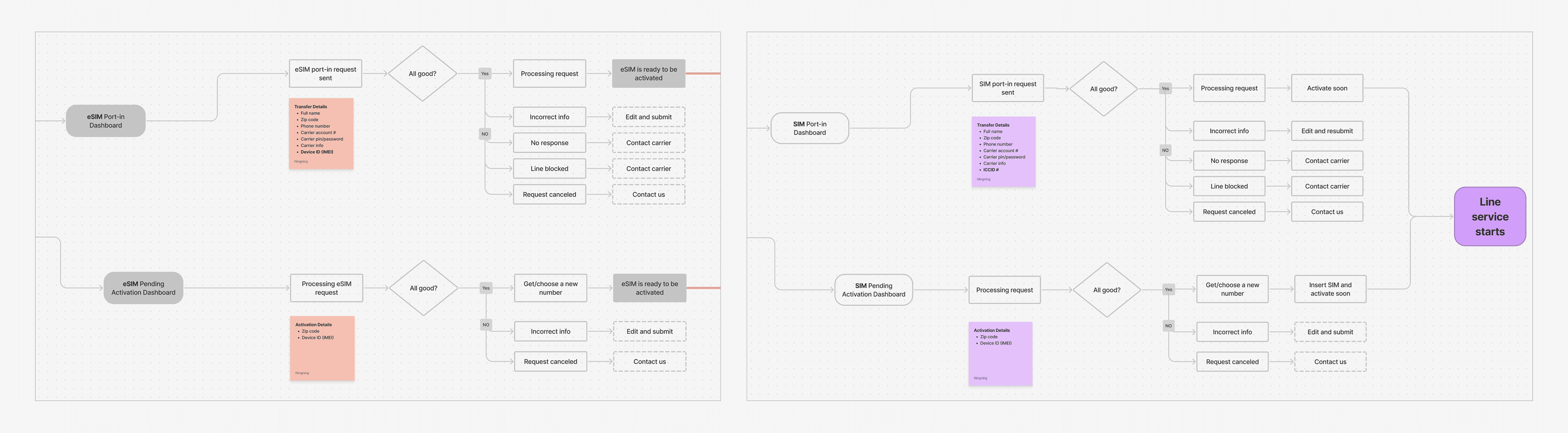
System side
I partnered with the PM to understand how the system handles line setup behind the scenes. I learned that the backend already has clear statuses and responses. I summarized them into a simplified flowchart to guide the dashboard design.
Designing the status experience
Exploring what “progress” could look like
With both user insights and the system flow in mind, I started by sketching and exploring multiple ways to visualize progress. The goal wasn’t to mirror backend steps directly, but to understand what “progress” could look like.

Defining a progress model users can trust
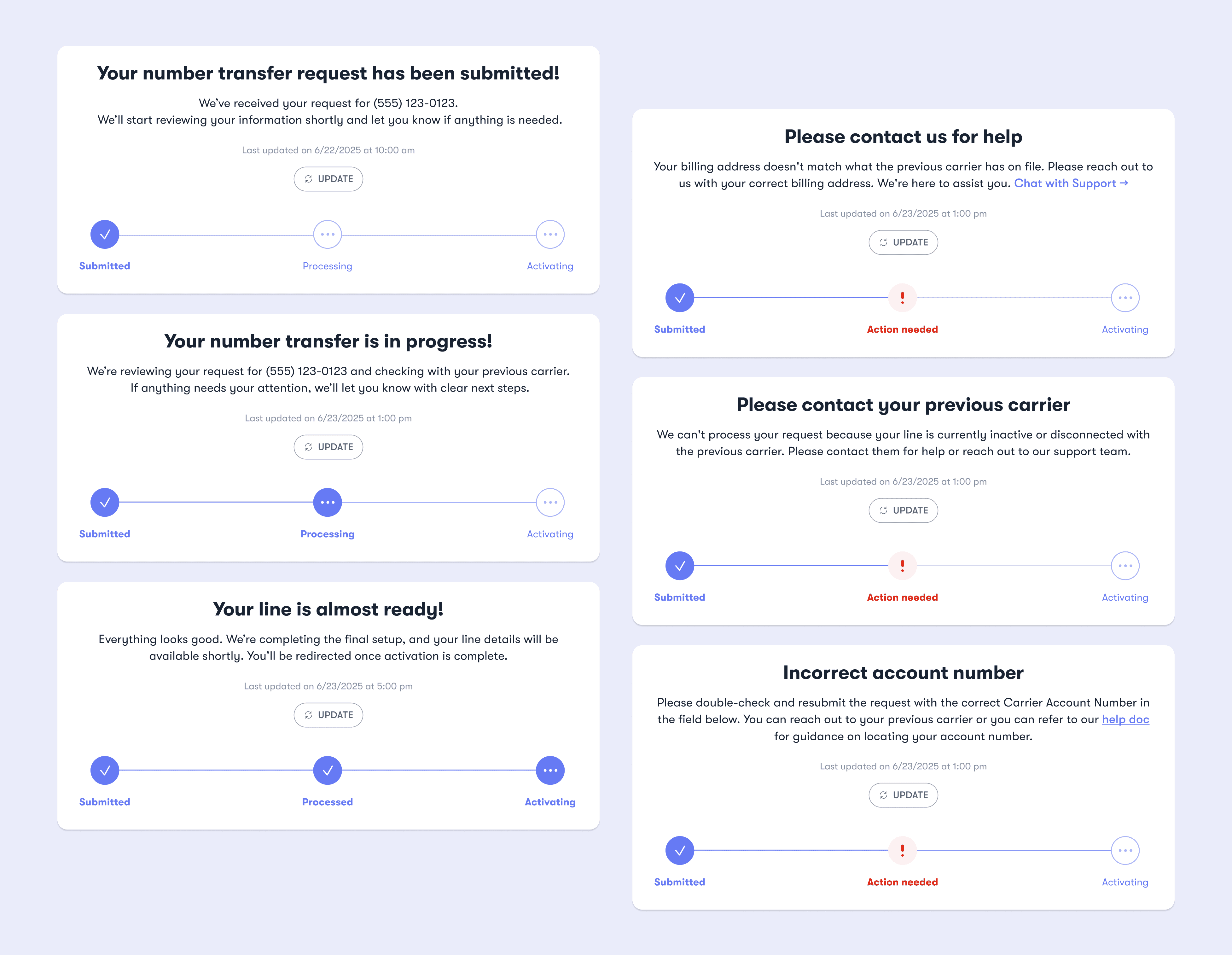
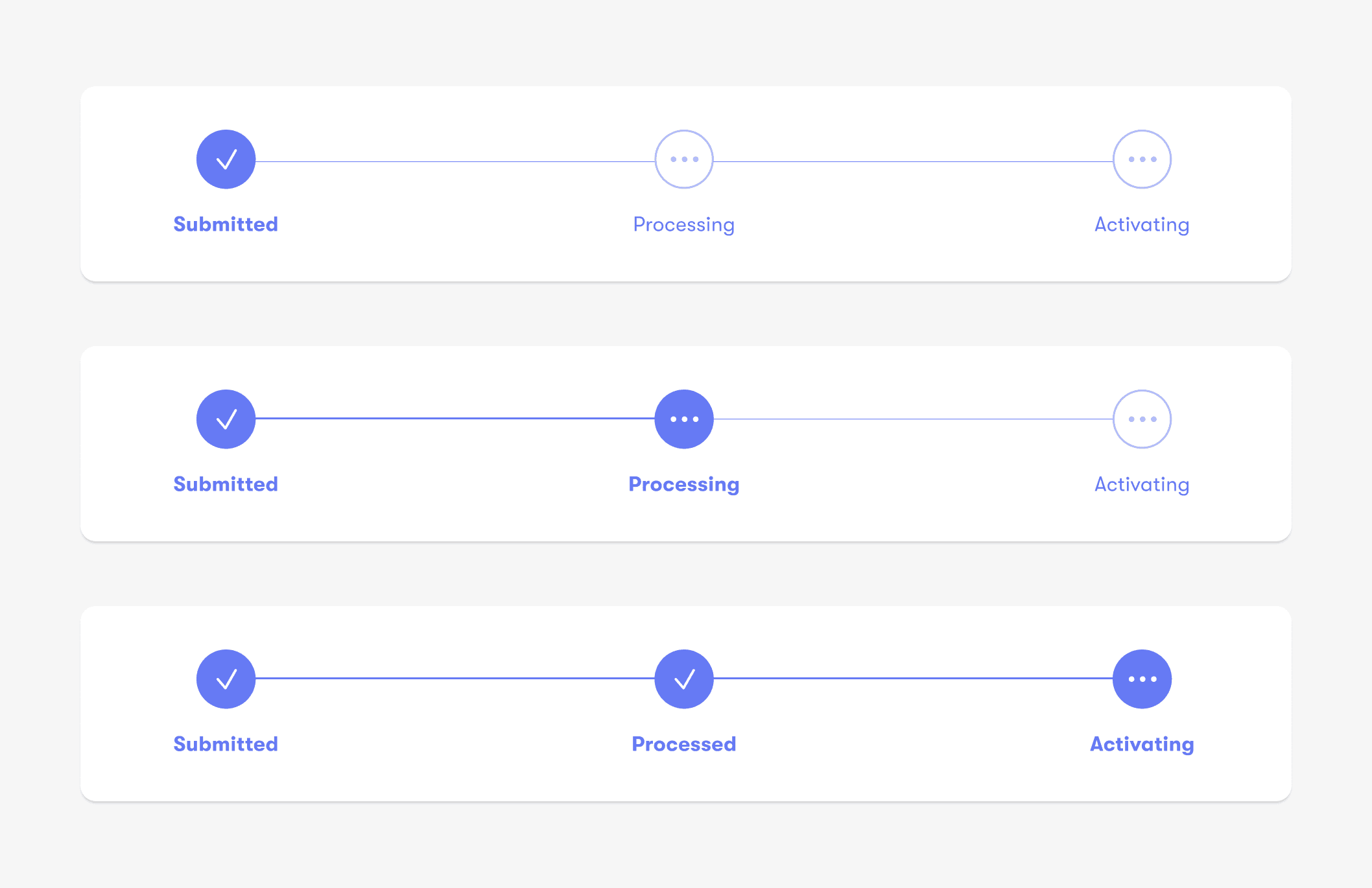
Based on the backend status logic and discussions with PM and engineering, we landed on a 3-step progress model: Submitted → Processing → Activating. This framework supported both number transfer and new number flows, keeping the experience consistent while reducing implementation complexity. Most importantly, it stayed simple enough for users to understand at a glance.
Crafting user-friendly status messaging
I partnered with the PM to define what users should see at each stage, translating backend terminology into clear, user-friendly language that reduces uncertainty during the wait.

Designing for the unhappy path
Grouping and categorizing error states
Errors happen, but showing 20+ error scenarios as unique states would overwhelm both users and the system. To keep the experience clear, I mapped each error to the next action users needed to take and grouped them into three consistent paths: Edit info, Contact carrier, Contact support.
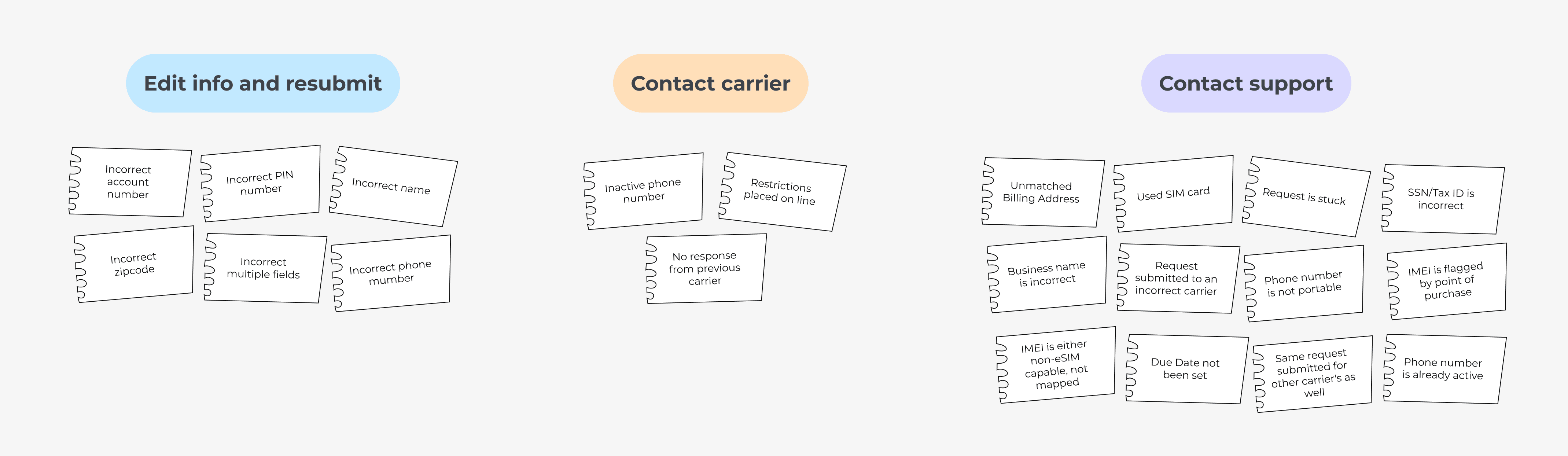
Designing consistent error states
Based on the categorization, I defined a consistent structure and baseline message for each error type. We designed one representative state per category to validate tone, layout, and CTA patterns. The remaining error cases reused the same framework, with only the reason-specific details changing.
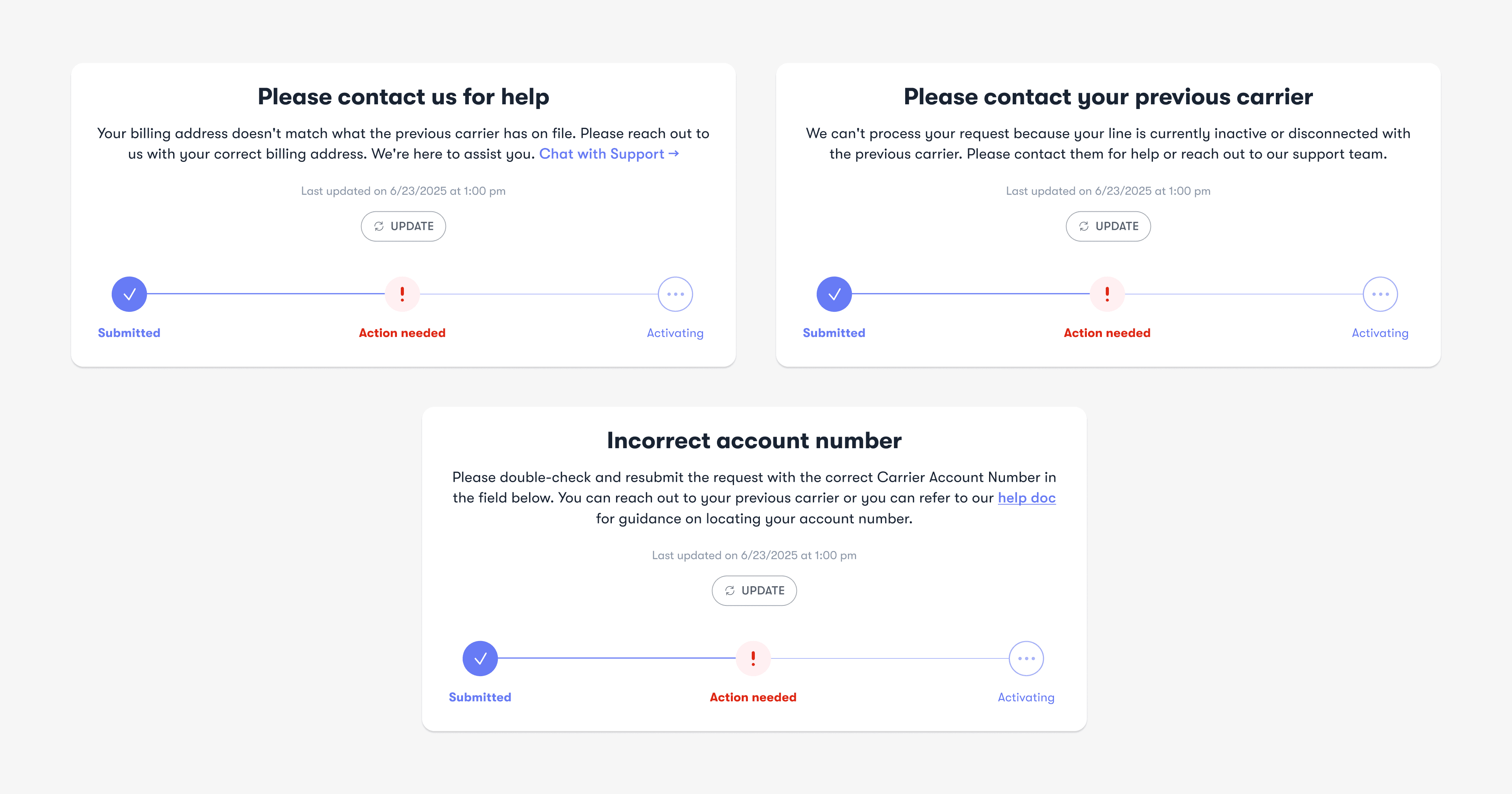
Helping users fix and resubmit
For errors that required updates to transfer details, I designed a clear edit-and-resubmit experience to guide users toward the next step with minimal friction.

Key takeaways
From system complexity to user clarity
Working closely with backend logic taught me that not every system state needs to be visible to users. The backend managed a wide range of statuses and mappings, but many of them could be grouped into clearer, action-based categories on the frontend. My role was to understand how the system worked beneath the surface, then translate it into a simplified, user-facing structure, deciding what users truly needed to know, and what could remain abstracted. This shift from mirroring system states to designing for user understanding became a defining lesson in the project.
Designing scalable error patterns
When presented with over 20 error cases from Customer Support, the initial volume felt overwhelming. But as I reviewed them more closely, patterns began to emerge. Many cases differed technically, yet required similar user actions. By categorizing errors based on what users needed to do next, rather than the system’s internal distinctions. I reduced complexity into three consistent resolution paths. This approach not only simplified edge cases, but also created a more scalable pattern for future system growth.

